Career & Entrepreneurship
Design Tips & Tricks: Part 1
Photo by Mark Fletcher-Brown on Unsplash
Having spent over a decade working in a number of corporate environments, it was a given that CI
(Corporate Identity) was a fundamental part of any growing or established business. It’s a set of visual tools that enables a business to assert itself and deliver its services and products with a professional and premium perception to its audience.
Unfortunately the realities are that a lot of small businesses, start-ups and one-man/woman enterprises just do not have the ready cash to invest sufficiently in having those tools created by a professional designer. They often turn to creating their logo, choosing their fonts and their colours themselves and making use of whatever software they have access to, on their home computer or some online creative portals.
It is really important to me as a professional designer that I can offer guidance and advice to those who need to venture into DIY design. I have compiled my how-to on some fundamentals of graphic design, to aid the novice designer so they can achieve something that has a professional edge. You can do a course on how to use Photoshop, Illustrator or InDesign but that will only get you so far.
So here is the first part of my top 10 tips & tricks:
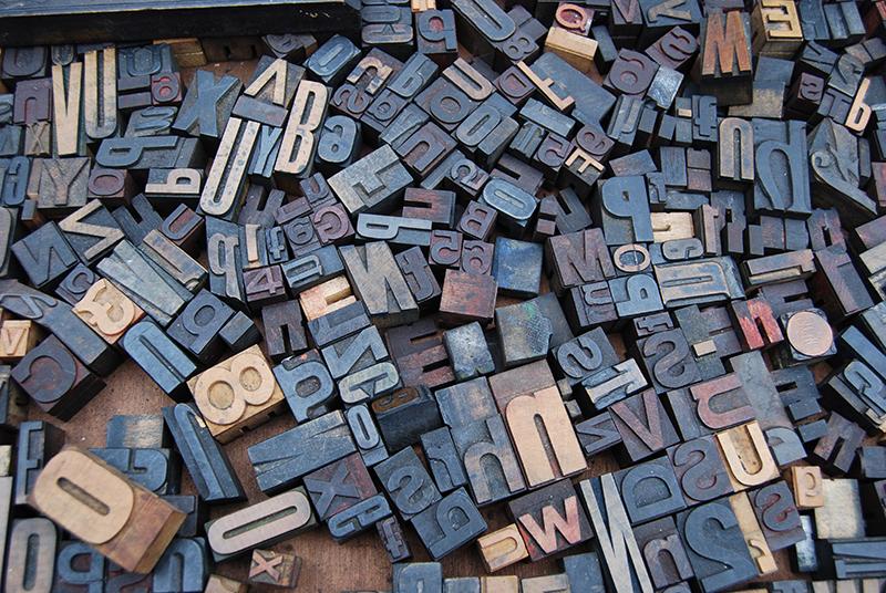
Fonts
Photo by Amador Loureiro on Unsplash
1. Fonts: Less is more
There are an infinite number of fonts to choose from, but most of the time you’ll only need 2. This is the first classic mistake of the novice designer. They see a list of beautiful and exciting typefaces and can’t decide so they choose too many. When you are creating a logo or a piece of marketing material, whether it be a Facebook post or a printed postcard, remember that you are creating a visual language that is unique
to you and your business. The simpler your language, the easier it is for your audience to build a clear association with you and what you stand for. In addition, you are creating a systematic way of helping them navigate through your content. I’ll come to that in a bit more detail later.
Fonts are the ideal method to create hierarchy. Solid strong fonts are clearly titles. Thinner, less dominant fonts are a secondary thought. Complicated script like fonts – are usually bypassed. They look nice but they require effort for an internet ‘skimmer’ to translate and absorb.
Top Takeaway: Use fonts that compliment not compete for attention. So usually one that is
visibly stronger than the other, so that something as simple as a title, is clearly the title!
2. Consistency
Consistency in any aspect of design is fundamental. There should be purpose and a system in place for every decision that you make. Why you may ask? For a plethora of reasons. Consistency is one of the easiest ways to demonstrate to your audience you are the best at whatever it is that you do, because you value the accuracy of anything you share with them.
It also increases engagement by creating an opportunity for your audience to build up a level of familiarity with your brand. This is especially effective when you promote from within social media channels, where your market is constantly being bombarded with advertising and promotion. Being accurate with your content enables your audience to perceive you as a professional, and not allow them to be distracted. Distracted by mistakes or complex and unnecessary details. Like random use of colours or fonts.
Top Takeaway: Inconsistencies create distraction & confusion. Consistency builds an audience.
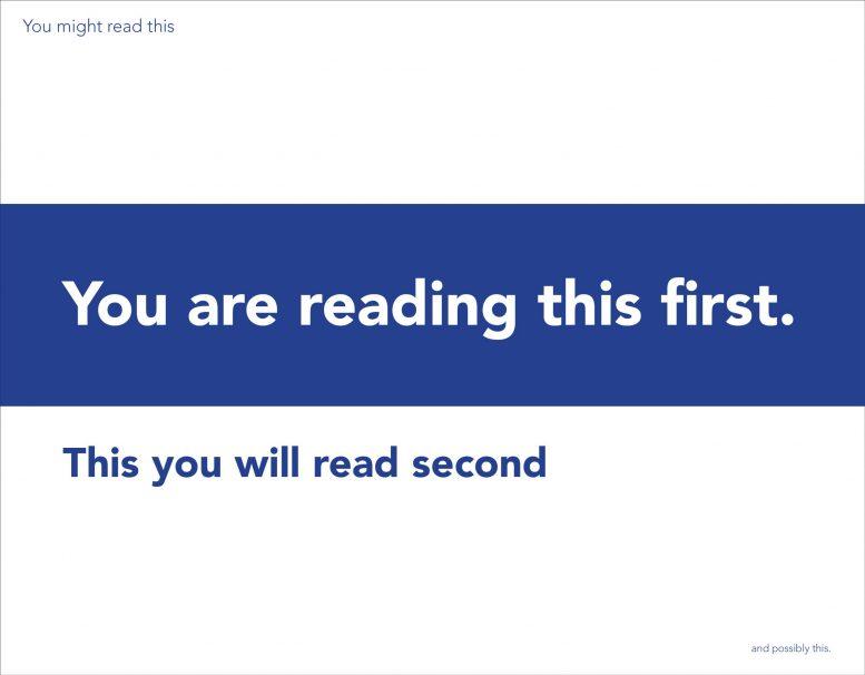
Text formatting Original layout – no credit required
3. Visual Hierarchy: A map for your audience
When creating a piece of design, whether it be a presentation, a flyer, a logo or your next post on Instagram, at the forefront of your mind should be your audience. With this comes a long list of questions you should almost systematically tick off as you proceed. One of the most vital questions is how to get my message across in exactly the way I want. Can I control the actual order a person reads my piece of design? Yes, you can.
Think about a magazine cover, a newspaper spread or a billboard. The designer behind these had a goal in mind. The position of every piece of text and image was deliberate. Deliberately placed to dictate how you read and view the content. They did this by creating a systematic level of hierarchy, using a combination of fonts, text sizes, graphical details, colours and alignment. So next time you are on Canva designing your next flyer, give some more thought to what text you make bold, or how you position it, so that you can guide your reader through your content like a clearly defined map.
Earlier I suggested that you should limit the number of fonts you use. This is one of the primary reasons why. Too many fonts create confusion along their journey and makes your design less affective when you have a specific message you want to deliver.
Top Takeaway: If your audience has no idea where to look first, then how can you ensure your message is delivered effectively and with the correct tone of voice.
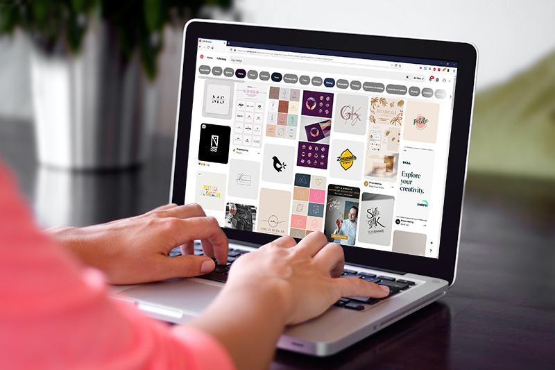
Logos on Pinterest (edited) Photo by Phil Desforges on Unsplash
4.Be different – Searching the internet with caution!
There can be a tendency to follow design trends when it comes to picking logos for your business, but an important characteristic of any design is longevity. So, it is import to be careful when following trends. For example, if you were to go to Pinterest and put in logo design in the search bar, your results will look something like my image here….and if you keep scrolling down its more of the same.
The current trends in logo designs are thin, elegant often illegible fonts and lots of coral and earth tones. Which are by no means bad design now, but there is a good chance they will be later. Keep in mind you want your business to grow and last, and the same goes for your logo. Choose something that avoids trends and above all is directly a reflection of you or your product. Don’t let trends send you down a road that will lead you to re-designing your logo in a couple of years.
Top Takeaway: You need to stand out in the crowd if you are going to be successful. Be
unique, because you are!
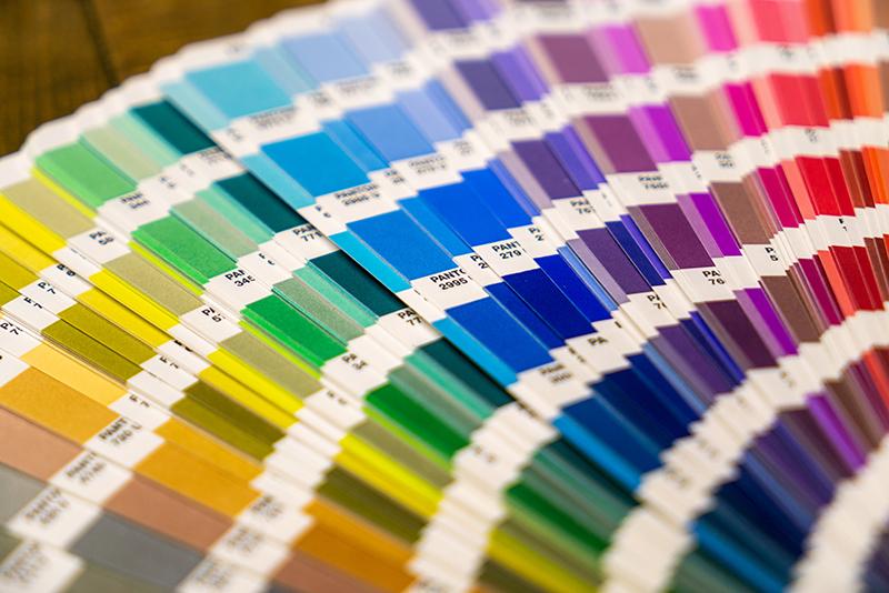
Colours
Photo by Mika Baumeister on Unsplash
5. Colour: Don’t re-invent the wheel
A simple but effective tip when choosing colours is being guided by what already exists. So,for example, you have a photograph and you want to include it on a social media post. You need to accompany this with a caption, either on top of the image or next to it in a box perhaps. You then need to choose a colour for the text or the box.
If you don’t already have one, try to establish your visual Identity and stick to a set of colours to create a certain level of consistency. When selecting colours, try to remain objective. You may have certain personal preferences but depending on your type of business, dismissing certain colours may limit your market reach. On the other hand, if at the heart of the business is ‘you’ then it’s almost fundamental to pick a colour scheme that reflects your personality – if that is what you are selling.
If you haven’t got a visual identity in place a really effective way to select a colour is to look at that photograph. Look for something significant and then take that colour and use it. Ever worn a green shirt and been told it brings out the green in your eyes? If in doubt, this principle in design works every time!
Top Takeaway: Be restrained and avoid random choices of colours.
If you enjoyed these tips & tricks keep an eye out for Design Tips & Tricks: Part 2 where I will look at other topics like text formatting, using icons & graphics effectively, and revealing what us designers mean by ‘white space’…
About the Author:
 Hayley Milne Payne is a passionate, classically-trained Graphic Designer, originally from London. She completed her Masters in Creative Arts Business and got her first break working in the marketing team for Chelsea Football Club. She relocated to Switzerland in 2007 and worked as a brand manager and Creative Services Manager at top sports marketing agencies. She is now an independent creative designer and consultant. Hayley often switches her Graphic Designer hat for her Sugarcraft Designer hat, designing bespoke cake creations and offering creative cake decorating workshops and team-building events for children and adults. You can see her work and contact her on her site – www.craftychameleon.ch or follow her on Instagram and Facebook. http://www.linkedin.com/in/hayleymilnepayne