Career & Entrepreneurship
Design Tips & Tricks: Part 2
In Design Tips & Tricks: Part 1 I shared with you my top 5 topics when attempting any graphic design project. In part 2, we are going to cover 5 more to help you really finesse any piece of design.
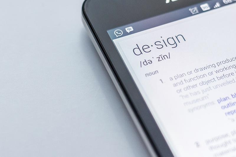
Photo by Edho Pratama on Unsplash
Firstly a quick re-cap:
When selecting fonts and colours, be restrained and strategic with your choices, to help create a clear and finite visual language. Above all, avoid a competition between the ones you choose.
Be consistent with your approach to design layouts. Understand and appreciate that you are creating a visual journey for your audience and that inconsistent design can distract from delivering your message accurately and with the tone of voice you intend. Creating a visual hierarchy is your greatest and simplest tool in selling yourself.
Don’t be afraid to be different and avoid blending in with the crowd with ‘trendy’ designs, if you want to be noticed. There is a lot of competition out there.
Now for my 5 remaining tips & tricks:
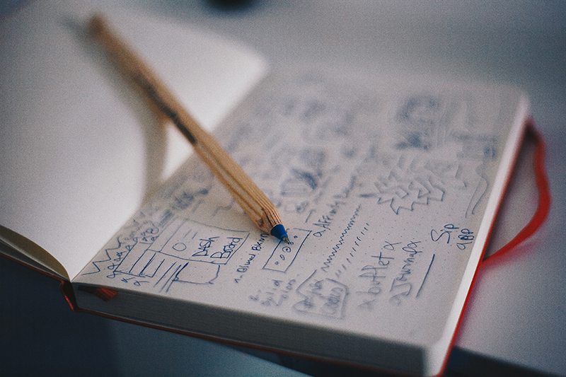
Photo by Med Badr Chemmaoui unsplash.com
- Plan, Plan and plan some more.
There are plenty of people who believe that to be a designer, all your need is to learn how to use a few bits of industry standard software. Wrong! – That is simply not the case. You need to get creative, imaginative and step-into the shoes of your audience. This requires some element of planning that absolutely does not involve using the computer. So, turn your computer off before you start, grab a pen and paper and start here. If you start using a computer before you have a clear idea in your ahead about the layout or piece of design you want to achieve, it will never turn out well. You can spend hours, if not days fiddling with ideas and design layouts, and that time is doubled if you attempt to do this without sketching it out first.
Think about the bigger picture, this one piece of design, say a flyer for example, is just one piece in your portfolio of promotional material. Make sure you plan out in your mind ALL your marcom material before attempting one, otherwise there is a pretty good chance when you try to apply the same design on to something else, you’ll be forced to adapt the concept and then you will lose the ability to build your brand and a visual language that your clients start to associate with.
Top Takeaway: Even if, you can only draw a stickman, that will do. Always play around with your ideas on paper before switching on your computer. This will save you a lot of time!
- Simplicity is Key
In life some things require an over-the-top delivery and then others sheer simplicity. For instance, if you ask my son he can never have too many sprinkles on his Ice cream – understandably you can’t go wrong here. However, when it comes to design over-doing things can be your downfall.
Design in many situations requires a restrained approach, and a refreshing air of simplicity. Whilst dabbling with some design tools, you’ll soon get distracted by the lure of fancy tricks and move away from the planning you had spent so much time doing. I have spent many years training professionals in the art of creating presentations. At no time have I recommended heavy use of special effects, shadows and animations, because it’s simply background noise. Think of your brilliant piece of design like a great pair of noise cancelling head phones, that helps your audience focus on you, when they are bombarded with marketing from every angle of life.
Top Takeaway: If you want your market to see you, don’t hide behind a wall of irrelevant tricks, be you in your simplest and clearest form, and that’s how you will stand out.
Photo by Edward Howell on Unsplash
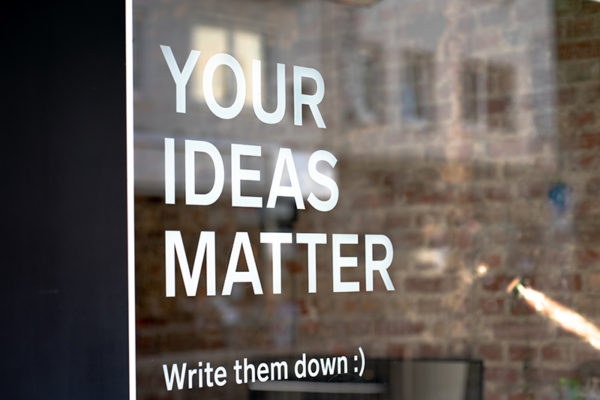
- White Space – what?
This is one of the easiest aspects of design to implement yet it is almost always ignored. Don’t overcrowd your pages with content.
More common than not is the tendency to fill space with as much information as you possibly can. Don’t be afraid to give your designs room to breathe. In actual fact ‘white/clean’ space around elements of your design have the ability to elevate the content. It is the easiest trick in the book. It has the ability to take a very amateur design to the next level and look professional.
Think of luxury goods branding. Apple, Chanel, Rolex. Their minimal look and feel makes them appear timeless. A valuable quality of any brand.
It can be so tempting to cram in images, graphics, and text wherever you can squeeze it in. However, space amongst your layout can help direct your audience and enforce your message. Try not to think about empty space being a wasted opportunity. Think of it as an element of your design, an instrumental one in making your design more legible, for a start!
Top Takeaway: When creating any piece of design, visualise an imaginary exclusion zone around each element. What is appropriate and what is not? Step back and take a look at some high-quality brands and their approach to compositions, and be inspired.
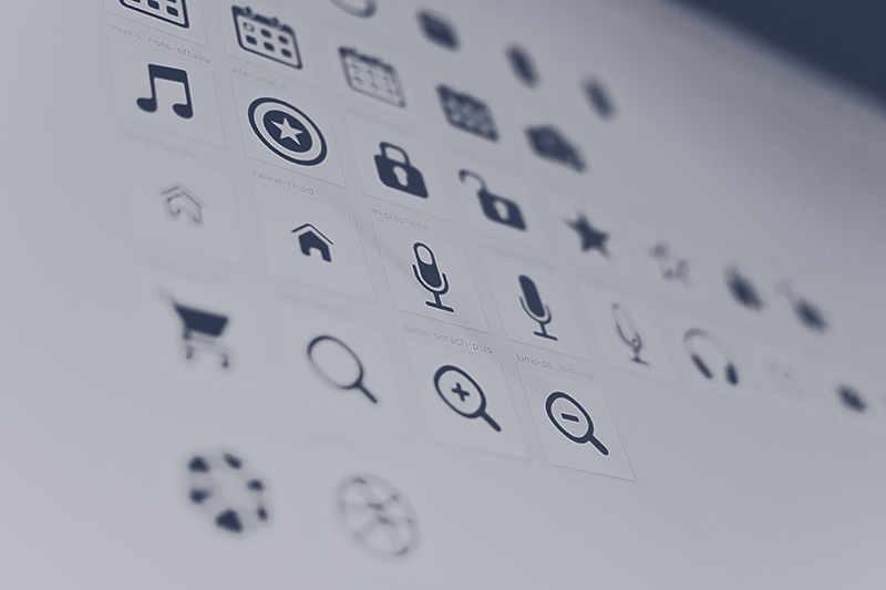
Photo by Edward Howell on Unsplash
- Effective use of graphics: Designers love iconsWhen you are creating promotional design content, it is often the case that you end up with a lot of content and your first thought is to reduce your font sizes to fit everything in – I see this often. Especially if you have read my previous tip about white space and are finding it impossible to implement this method. In addition, I often see social media posts where people have added their logo on to their post, but it is so small, it is actually diluting their brand image.
Re-read your copy and try to reduce reduce reduce. Edit it into it’s simplest form for anything promotional, if you are expecting people to read it. Then read it again and consider the content in a visual illustrative form. Us designers, we love white space and one of the most helpful ways to achieve this is by replacing repetitive content with graphics or icons, which we equally love. Symbols are an excellent way to organise content, and we are conditioned in everyday life to translate them a lot quicker than full sentences. From road signs to the back of a cereal boxes.
There are tons of places out there to get them free if you haven’t the skills to produce your own, and they can be modified easily to fit in with the style of any brand. You’ll find millions here for free, www.flaticon.com but there are plenty of alternative resources out there.
Top Takeaway: Avoid filling your websites or marketing material with repetitive written content. Don’t forget how little time people spend on websites or reading ads. So, use graphical diagrams or icons to help them navigate to the good stuff, and fast!
Now to my final and most fundamental point – Text!
- Text formatting: Don’t make reading your designs a chore.
I could easily write an article just on text formatting but here is the most important thing to remember. Help the reader, which means you want to make it as easy as possible to read whatever is written. Don’t make reading it a chore.
A simple way to make it easier for your reader is to not justify your paragraphs fully from left to right. You are unnecessarily creating uneven spaces between every word. Making it significantly harder for the human brain to read, and most importantly making it slower for them to digest.
If you have text in various different text boxes, make sure they are all aligned perfectly down one side or in the centre. Inaccurate placement distracts people from the point you are making.
Give your text room to breathe. So, don’t scrimp on margins or space between lines and paragraphs. Again, it’s just giving your text a more inviting environment for people to actually want to read it.
Top Takeaway: Remember your user journey. Putting that extra bit of effort into your designs will prevent your audience having to do the work themselves. Increasing the chance, they might actually buy in to whatever you are selling!
I hope you are inspired and feeling confident about giving some design a go yourself, and if you want the full recap on the previous 5 tips and tricks, check it out here.
About the Author:
 Hayley Milne Payne is a passionate, classically-trained Graphic Designer, originally from London. She completed her Masters in Creative Arts Business and got her first break working in the marketing team for Chelsea Football Club. She relocated to Switzerland in 2007 and worked as a brand manager and Creative Services Manager at top sports marketing agencies. She is now an independent creative designer and consultant. Hayley often switches her Graphic Designer hat for her Sugarcraft Designer hat, designing bespoke cake creations and offering creative cake decorating workshops and team-building events for children and adults. You can see her work and contact her on her site – www.craftychameleon.ch or follow her on Instagram and Facebook. http://www.linkedin.com/in/hayleymilnepayne
Related Posts
The Design Process – Dos and Don’ts – Part 1

Beauty isn´t a size – Tips on what to wear

3 tips to help students to pursue their dream career goals

Improving your active listening skills

Relationship & Intimacy Coach Nathalie Sommer gives her expert advice on the five different stages of sensual intimacy